Заглавная страница Избранные статьи Случайная статья Познавательные статьи Новые добавления Обратная связь FAQ Написать работу КАТЕГОРИИ: ТОП 10 на сайте Приготовление дезинфицирующих растворов различной концентрацииТехника нижней прямой подачи мяча. Франко-прусская война (причины и последствия) Организация работы процедурного кабинета Смысловое и механическое запоминание, их место и роль в усвоении знаний Коммуникативные барьеры и пути их преодоления Обработка изделий медицинского назначения многократного применения Образцы текста публицистического стиля Четыре типа изменения баланса Задачи с ответами для Всероссийской олимпиады по праву 
Мы поможем в написании ваших работ! ЗНАЕТЕ ЛИ ВЫ?
Влияние общества на человека
Приготовление дезинфицирующих растворов различной концентрации Практические работы по географии для 6 класса Организация работы процедурного кабинета Изменения в неживой природе осенью Уборка процедурного кабинета Сольфеджио. Все правила по сольфеджио Балочные системы. Определение реакций опор и моментов защемления |
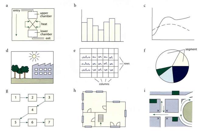
Label the following using the words from the boxes.Содержание книги
Поиск на нашем сайте
VII Reading Read the following information about using graphs in presentations and fill in the following table.
Reasons for Using Graphics Graphics in written and oral reports are invaluable aids to your audience because they condense text, clarify relationships, and highlight patterns. Good graphics display the significance of your data (which may be more exactly displayed in a table) and allow the reader to follow your discussion. Drafting graphics may also be a very effective way to help you draft a long written report or oral presentation.
Common Graphics Graphics commonly used in technical documents include the following: Working drawings Diagrams Tables Photographs Bar graphs Exploded views Line graphs Schematic diagrams Pie graphs Flowcharts Illustrations Timetables or Gantt charts
Working Drawings Working drawings may be used to give detailed descriptions of the current state of your experimental apparatus and as common graphics in oral design reviews. Working drawings may be highly detailed and may present exact specifications for the construction of apparatus. Identify working drawings with an explicit title and the date. Be sure to show tolerances and exact measurements and, if necessary, a scale of measurement on all figures.
Tables Tables present data in a highly condensed form. Tables present data more exactly than a graph, but they do not readily display the trends within your data. (They should rarely be used in an oral presentation – rely on figures instead.) Every table is identified in a written report by a number and a title, placed above the table. In contrast, the number and title of a figure in a report are usually given below the figure. The parts of a table include
If any table or figure is taken from another source, proper credit must be given in a source note below the table or figure.
Table 1. The volume of solution in ml delivered from a random sample of 1.00 ml capacity tuberculin syringes with Luer slip tips and 9.5 mm 27 gauge needles with intradermal bevels.
--Seth Frisbie, The Determination of Total Dissolved Inorganic Carbon in Pure Systems
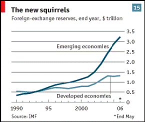
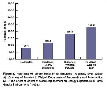
Bar Graphs Bar graphs display relationships among data by means of vertical or horizontal bars of different lengths. Sometimes a single bar of a set height is used to break down percentages of the whole, in much the same fashion as a pie graph. Single Bar Graph Single bar graphs visualize the effects of varying limiting conditions on one particular object of study, as in Figure 5, where heart rate is shown under various burden conditions of exercise.
Multiple Bar Graph Multiple bar graphs visualize the different objects of study under one particular limiting condition, as in Figure 6, where three items are compared over time.
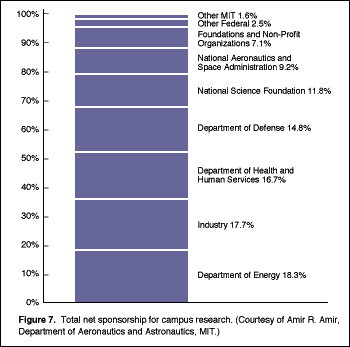
Stacked Bar Graph Stacked bar graphs visualize various items as percentages of the whole for ease of comparison and contrast. Figure 7 is a single bar graph showing percentages of one particular object of study. (Compare this figure with Figure 11, a pie graph drawn from the same data.) Figure 2 is an example of a multiple stacked bar graph where various items are broken down into percentages of the whole for comparison.
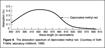
Line Graphs Line graphs visualize trends among dense data sets, which are sometimes listed in an accompanying table in a report. Data points are plotted with relation to a vertical axis showing the dependent variable and a horizontal axis showing the independent variable. A line is then drawn through these points to display significant trends, as shown in Figure 8, an example of a single line graph.
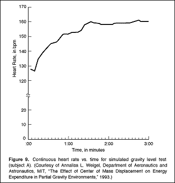
The intersection of the x and y axes is always the zero point. Put a break point on the y axis if the data span a range too large to fit in your graph, as shown in Figure 9.
If for some reason zero is not the starting point for your axes (because the values are too high, for example), then state that explicitly in prose within the figure or indicate it on the axes themselves.
To use line graphs effectively, follow these guidelines:
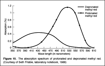
Multiple Line Graphs Multiple line graphs show comparison between two (or more) data sets for the same value, as shown in Figure 10, in which data for the item of study in Figure 8 are not compared with data for another item.
Pie Graphs Pie graphs pictorially represent percentages of the whole by showing these percentages as "slices" of a complete circle (the complete circle represents 100 percent of whatever item or quantity you are discussing). Be sure that the percentages of the whole represented by the slices total 100 percent. The number of percentage slices drawn on a pie graph may vary. Too many segments may make your graph unreadable; too few segments may make it useless for discussion. A carefully sized and composed pie graph will permit you to include more than the usually recommended five items, affording you greater scope in making comparisons, as shown in Figure 11.
Label all sections clearly with the percentage and the name of the item being depicted. Pie graphs give a striking and quick representation of simplified data. They are most often used before nonexpert audiences because the relationships of data are not highly detailed.
Illustrations Illustrations can provide your reader with a large amount of information about an object or topic in a very small space. An illustration can accurately depict the form of an object, help the reader to visualize how the object functions, or show the relationship of one object to another. It allows you to focus your audience's attention precisely on the details that you are describing, as shown in Figure 12.
To use illustrations effectively, follow these guidelines:
Figure 13 presents several overviews of an object, illustrating the overall form of the object as well as the relationship of parts to whole.
Diagrams Diagrams are used to show the relationships between several objects or to portray the function of an object. Diagrams are similar to illustrations in that they are often pictorial representations of an object, but they are often more abstract than illustrations. For instance, the elements that make up a diagram may not be drawn to scale with respect to each other; rather than give an accurate picture of the appearance of an object, the goal of a diagram is to help the reader understand how the elements in the diagram are connected. Figure 14 is an abstract, pictorial diagram visualizing a transfer line setup connecting a holding tank to a tank car.
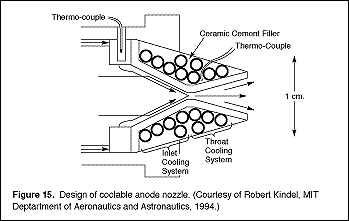
Figure 15 is a pictorial representation of an experimental design for a coolable nozzle, showing the interrelationships of parts.
To use diagrams effectively, follow these guidelines: · Keep your diagrams simple. Include only those details that will be relevant to your discussion. · Label the elements of your diagram clearly. · Identify each diagram with a figure number and a caption.
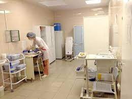
Photographs Photographs can provide an overall view of an object, especially when the object is new or strange, or they may record results that rely on visual inspection, such as X-rays or the effects of destructive testing for failure in materials. To use photographs in a report effectively, you must
If you need photographs for an oral presentation, use a 35-millimeter projector to display them. Photographs transferred to overhead acetates by photocopying machines are usually too dark to be easily viewed by the audience.
Exploded Views Exploded views present the interrelated parts of a complex object in near proximity so that your audience can see at a glance the total effect of the placement or interaction of part to whole, as shown in Figure 18.
All parts of an object in an exploded view are identified by name. The figure as a whole is given a number and a caption in a written report. Figures of this type are useful for quick, at-a-glance introduction of complex objects (sometimes, the point of an exploded view is to show just how complex a familiar object can be). Exploded views do not allow you to focus on parts of the apparatus, however. Therefore, combine this kind of illustration with more detailed illustrations for a complete analysis.
Schematic Diagrams As with other kinds of diagrams, which stress the general or abstract over the realistic, schematic diagrams employ highly specialized, technical symbols to depict the workings of a sytem or apparatus, as shown in Figure 19.
Schematic diagrams should only be used to communicate with a technical and expert audience. Flowcharts A flowchart is traditionally defined as a detailed diagram of the operations or equipment through which material passes. But a flowchart can be any kind of schematic diagram which shows pictorially or by means of symbolic representations a sequence of operations for any process. A common form of flowchart depicts the sequence of subroutines and flow of information within computer programmes, as shown in Figure 20.
Timetables (Gantt charts) Timetables, or Gantt charts, give a visual presentation of the relative timing of the separate tasks that make up a unified project. With just a glance at a timetable, a reader can ascertain the variety of tasks involved in a project and how the tasks are related chronologically, as shown in Figure 21.
There are a variety of software programmes you can use to generate and update your timetables automatically.
Practice Use the following graphs and the vocabulary from the above tables to describe the movement of the various objects concerned. 1. 2008 World Clothing Sales
2. 2008 World Clothing Sales Percentages
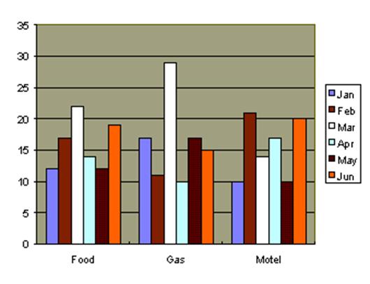
3. Travel Expenses
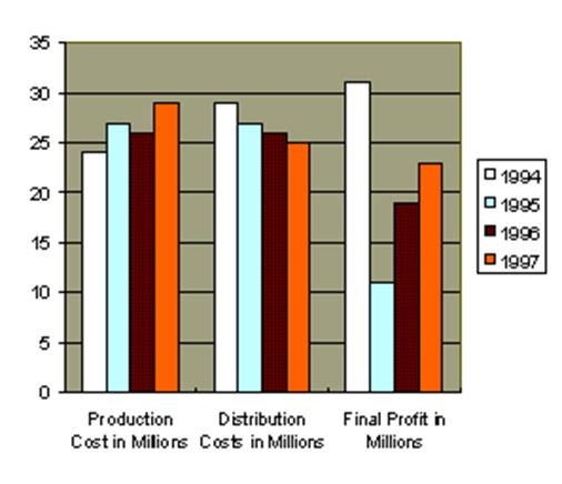
4. 2007 Production and Distribution Costs Compared to Final Profit
5.
6.
7.
8.
10.
11.
12.
13.
14.
15.
16.
Language Note Referring to visuals I'd like you to look at this... Let's look at this... As you can see from this... Let me illustrate, … As this... shows,... As an illustration,... Describing Movement
Degree of change
Speed of change
Explaining causes This is a result of.. (e.g. This is a result of bad management. ) This is because of... (e.g. This is because of bad management. ) This is largely due to... (e.g. This is largely due to bad management.) ... contributed to this. (e.g. Bad managementcontributed to this.)
Describing results As a result, we will have... (e.g. As a result, we will have a drop in sales.) It could lead to... (e.g. It could lead to a drop in sales.) It may result in... (e.g. It may result in a drop in sales.) ... will be a direct result. (e.g. A drop in sales will be a direct result.)
rise by (2%//1000 units) підвищуватися/зростати на (2%//1000 одиниць) rise to (2%//1000 units) підвищуватися/зростати до (2%//1000 одиниць) Examples: There was a gradual decline in sales. (noun usage) Sales declined gradually. (verb usage) Enrollment increased by 4% in 1997. There was a 4% increase in enrollment in 1997. Immigration rose to 800,000 in 1999. (to a point/number) Taxes remained the same from 2000 to 2001. Sales stood at $ 1,400,000 in 1998.
Quick Communication Check Presentation Phrases Look at these presentation phrases and decide whether they: refer backwards, refer forwards, refer to visuals or deal with interruptions. 1. This graph indicates... 2. As I said earlier,...
Vocabulary 1
Choose the right variant: a, b, c or d.
1. Which of the verbs below is the opposite of 'top out'? a. bottom out b. come out c. fall out d. go out 2. Which of the verbs below means 'fall by a large amount'? a. rocket b. crash c. soar d. level off 3. Which of the verbs below is the opposite of 'improve'? a. dwindle b. decrease c. drop d. deteriorate 4. Which of the verbs below does not mean 'fall'? a. level off b. crash c. deteriorate d. plunge 5. Which of the verbs below is a synonym of 'go down'? a. plunge b. increase c. surge d. soar 6. Which of the verbs below means 'not to change'? a. soar b. plunge c. rocket d. level off 7. Which of the verbs below is the opposite of 'increase'? a. rise b. soar c. go up d. tumble 8. Which of the verbs below is a synonym of 'increase'? a. dwindle b. soar c. fall d. plunge 9. Which of the verbs below means 'fall quickly and without control'? a. decrease b. dwindle c. surge d. tumble 10. Which of the verbs below means 'increase suddenly and greatly'? a. dwindle b. crash c. plunge d. surge Opposites
Match the opposites.
1. rise a. fall short of 2. boom b. slump 3. increase c. rapid 4. peak d. reduce 5. slight e. sudden 6. exceed f. dramatic 7. gradual g. decline 8. growth h. fall 9. slow i. trough 10. expand j. decrease
4. Vocabulary 2 Look at the following graph and put one of the numbers next to the given words:
Describing trends
Choose the correct description (1-8) for each graph (a-h)
1. There has been a steady increase in costs over several years. 2. At the end of the first year sales stood at 50 percent of the present level. 3. The share price reached a peak before falling a little and then maintained the same level. 4. Sales of product A fell slightly in the final quarter. 5. The sudden collapse in share prices has surprised everyone. 6. The level of investment rose suddenly. 7. Research and development budget has stabilized over the past few years. 8. The value of the shares has shown a steady decline.
|
||||||||||||||||||||||||||||||||||||||||||||||||||||||||||||||||||||||||||||||||||||||||||||||||||||||||||||||||||||||||||||||||||||||||||||||||||||||||||||||
|
|
Последнее изменение этой страницы: 2016-04-18; просмотров: 1203; Нарушение авторского права страницы; Мы поможем в написании вашей работы! infopedia.su Все материалы представленные на сайте исключительно с целью ознакомления читателями и не преследуют коммерческих целей или нарушение авторских прав. Обратная связь - 18.116.85.96 (0.009 с.) |


 9.
9.