Заглавная страница Избранные статьи Случайная статья Познавательные статьи Новые добавления Обратная связь КАТЕГОРИИ: ТОП 10 на сайте Приготовление дезинфицирующих растворов различной концентрацииТехника нижней прямой подачи мяча. Франко-прусская война (причины и последствия) Организация работы процедурного кабинета Смысловое и механическое запоминание, их место и роль в усвоении знаний Коммуникативные барьеры и пути их преодоления Обработка изделий медицинского назначения многократного применения Образцы текста публицистического стиля Четыре типа изменения баланса Задачи с ответами для Всероссийской олимпиады по праву 
Мы поможем в написании ваших работ! ЗНАЕТЕ ЛИ ВЫ?
Влияние общества на человека
Приготовление дезинфицирующих растворов различной концентрации Практические работы по географии для 6 класса Организация работы процедурного кабинета Изменения в неживой природе осенью Уборка процедурного кабинета Сольфеджио. Все правила по сольфеджио Балочные системы. Определение реакций опор и моментов защемления |
Presentations in English: development and delivery
A look at slides design
From Part 1 you already know the rules to play by when preparing a presentation in Russian. Basically all of them can be applied to presentations in the English language. This part introduces some more ideas for presenting a PR campaign project. The main focus is on planning and structuring the content. This part also concerns some approaches to slides design. Look at the description of some PowerPoint slides produced by an unskilled presenter. They were supposed to be a visual support for a live oral presentation.
There are 20 slides filled with 12-point text in several bright colours, each having a complicated title and a number of subtitles. No empty space. No visuals.
Is the presentation going to be successful? What would you do to make the slides more effective? 1. ___________________ 2. ___________________ 3. ___________________
Now compare your advice with the tips below. 1. Outline a plan of your presentation well before you open the presentation software. 2. Produce a clear and logical structure. 3. Stick to one topic per slide. 4. Use a short clear title for each slide. 5. Make the text of the slides big and the amount of text small so that everyone is able to read what is on the slide. 6. Prefer short points to full sentences, where possible. 7. Use tables, diagrams, graphs and other visuals. 8. Make sure each of them has a clear title.
While those may seem like common sense, when it comes to practice…
There is a saying: Advice is like castor oil, easy enough to give but dreadful uneasy to take. So, to make the tips easier to take and to follow, let us look at some slides design approaches more closely.
Outlining the content
It is a good idea to have a plan of what you are going to talk about before diving into PowerPoint. The best presenters often sketch out their ideas and objectives with a pen and paper. It takes time. But it will lead to more clarity. It will also save you time and effort when it comes to creating slides. Two strategies to sketch out your ideas are given below.
A mind map A mind map is a diagram used to represent ideas, tasks, or other items linked to and arranged around a central key word or idea. Mind maps are used to generate, visualize, structure, and classify ideas. The elements of a mind map are arranged intuitively according to the importance of the concepts, and are classified into groupings, branches, or areas.
Figure 1. A mind map sketching the communication element of the RACE model.
A flowchart
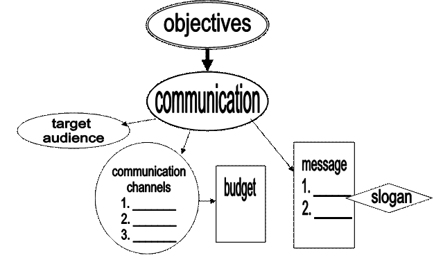
You may use a flowchart to fix you presentation flow step by step. A mind map shows associated ideas, not a process. You can say that it is a static model, whereas a flowchart is dynamic. Look at the flowchart below. It represents the RACE model of a PR campaign. The RACE acronym is a popular way to describe the process of public relations. It means that public relations activity consists of four elements: R esearch – What is the problem or situation? A ction (strategy planning) – What is going to be done? C ommunication – How the public is going to be told? E valuation (E volution) – Was the audience reached and what was the effect?
Figure 2. A flowchart representing the RACE model
Whatever sketching approach you use, having a rough storyboard will help you simplify your message in your own head. You will have the whole picture in your mind. It is then easier to lay out those ideas in PowerPoint.
Structuring the content
The next step is to design the proper structure of your presentation. Your audience needs to see where you are going. If you have made a flowchart outlining the content, it may seem to you that you have already organized your ideas in a logical fashion. But will it seem so to the audience? Not necessarily. A good presentation is something very much planned, direct and linear. So, you need to check your logic.
You can use one of the following models to organize ideas and information. They are typical and recognizable.
1. PROBLEM → SOLUTION (S)
If you have decided to use this model, first identify the problem. After that suggest a solution(s). Then you will need to describe the actions (possibly in a chronological order) and the expected results. This means that you will need to use the following two models.
2. ACTION (S) → RESULT (S)
3. Chronological order.
This kind of logic can be exemplified by the flowchart below.
NOTE. Each stage is normally represented by a number of slides. Make sure you stick to one topic per slide. Otherwise it will be difficult for the audience to follow you.
4. You might go from a list of points to detailed discussion of each point one by one. The flowchart below shows what a sequence of slides might look like in this case.
When you make a list, REMEMBER: 1. Number the points. 2. Use the same structure in all lines. (Notice the use of the imperative structure in both tips)
5. The RACE model. The models that have been discussed above can be incorporated into the RACE scheme (figure 2). Although it describes the typical stages of a PR campaign, it can be also used for sequencing the parts of a presentation. The examples below realize the RACE model. In each example there is a task.
EXAMPLE 1. TASK. Look at the short titles given below. What is the speaker going to talk about in each part? 1. BACKGROUND INFORMATION 2. PROBLEM 3. STRATEGY 4. TARGET AUDIENCE 5. MEDIA CHANNELS 6. EVENTS 7. BUDGET 8. EXPECTED RESULTS 9. EFFICIENCY EVALUATIOIN WARNING. All the BACKGROUND facts and figures should be relevant to the problem your campaign is intended to solve.
EXAMPLE 2. TASK. Look at the list of slides. The author forgot to cover two essential components of his campaign plan. What are the missing slides?
1. OBJECTIVES 2. STRATEGY 3. TACTICS 4. CALENDAR 5. BUDGET 6. EVALUATION Keep it simple and short Tips 4,5,6 from the list of tips in the introduction mean that you cannot put all the text on a slide and then just read it. During the presentation you are supposed to be talking to the audience, not to the screen. The audience is supposed to be listening to the speaker, not to be reading the slide. People just won’t manage to do both. Many presenters find it challenging to make short catchy titles and notes. It takes time and effort to learn to do so. To produce simple clear notes that would show your ideas to their best, follow the steps given below. 1. Write down the main points. 2. Decide on the order of ideas. 3. Extend the points so that there are full sentences or even paragraphs explaining the method in detail. Imagine you are writing an article. 4. Shorten the paragraphs. Turn them into short sentences in the SUBJECT-VERB-OBJECT structure. Have one sentence per slide. Use verbs in active tense (never use the passive voice in a presentation). 5. Avoid using long complicated words: replace them with shorter synonyms. 6. Look at the slides again. Can you see the main focus of each part by reading only the titles? 7. Read the notes aloud. Do they sound in a memorable way? For instance, phrases with a rhythm and alliterated phrases are better remembered. 8. Make the title slide (the first one). 9. Now try out how the slides work. Talk about each slide without looking at the text you wrote at stage 2. 10. Finally, for the presentation, write the text the way you speak about the slides. Remember, writing and speaking are different registers and should differ in style.
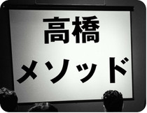
Now we are going to look at a presentation technique, which is based on very short notes. The "Takahashi Method" One person who has got a lot of people interested in his unique way of presenting is Mr. Masayoshi Takahashi. His method is now labeled the "Takahashi Method." Takahashi uses only text in his slides. But not just any text — really big text. Huge text. Characters (or letters and numbers) of impressive proportion which rarely number more than ten, usually fewer. His goal was to use short words rather than long, complicated words and phrases.
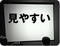
Besides, Takahashi, who is a computer programmer, did not have software like PowerPoint (the slide above says "I don't have PowerPoint"). He did not have access to photos or drawing programs either. So he was stuck with text. Still, he wanted to be different. He wanted to be effective. So he started thinking very hard about how to use the best word for each slide as he took the audience through his presentation. The words or phrases resemble Japanese newspaper headlines rather than sentences which must be read. His slides, though they are all text, are visual, visual in the sense that (if you read Japanese) they are instantly understood and support his talk. As he says, if you have full sentences, the audience will read those and may miss what you are saying. If there is too much text on the screen, many people can not read it because it is too small (though that rarely keeps people from trying to read the slides anyway). The method provides clear visual support for the audience and helps make the content more memorable. This method is easy to do. It helps the presenter get organized while planning and keeps the presenter on track while presenting. Once again, the idea is to use very, very large type on screen. If you combine Takahashi Method with other approaches the slides are usually a mix of full-screen, high-quality photos, some charts/graphs, and slides with single words, short phrases, or short quotations. Adapted from http://www.presentationzen.com
Answer the questions. 1. In what kind of situation did Takahashi first use his method? 2. Explain briefly what he did. 3. Why was it effective? 4. What did Takahashi use on his slides? a) full sentences; b) pictures and diagrams; c) words and short sentences in a “newspaper headlines” style.
TASK Prepare a short presentation on "The Takahashi Method." Look at the slides used by Takahashi in his recent presentation explaining the main points of his method.
On each slide you can use as many words as there are characters (or fewer). You can compare your slides with the English translation of Takahashi’s slides on p... SAMPLES STUDY.
Look at the following samples. The slides come from three different presentations. What is wrong with the slides apart from grammar mistakes? What would you do to improve the slides?
Sample analysis answers Slide 1. 1. The title has long words. It is not instantly obvious what the speaker is going to talk about. The strategy? The message? The tactics? 2. There is a passive structure in the first and the second points. 3. The calendar goes before the actions. It could be put on a separate slide after this one. 4. What is the fourth point? Is it an objective? Is it an action? This point is long and unclear. The structure is too complicated. Slide 2. 1. The words “the main aim of my PR campaign” are repeated in the text. 2. The second half of the sentence about giving people certain rights is inappropriate here. 3. This is rather strange to see a list that contains only one point. Slide 3. 1. How many words “of” are there? 2. A slide stating the aim should have one word in the title, which is “AIM”. 3. Do we really need that picture on the slide?
The answers to the task "The Takahashi Method". The English version of the slides. 1, 2: (Left) "The Takahashi Method" title slide. (Right) "Huge characters" — He stresses using large characters or letters on slides. 3, 4: (Left) "Easy to see" He states that small text is impossible for people in the back to see, so keep it "big." (Right) "History" Takahashi begins to talk about the background of his method. The use of visuals
As visual communication has proven really efficient, it has become an essential ingredient of a modern presentation. But remember, visual communication has to be really visual. The most efficient way to display facts, figures, trends, etc. is to organize them in one of the following visual ‘vehicles’. There is a range of them. Your task is to learn to decide on the most appropriate one and to design a visual so that it makes your point clear. Look at the most popular ways to visualize information. Flowcharts describe processes. For instance, figure 2 above shows a flowchart representing the RACE model. So, if you are going to talk about an action plan, use a flowchart as a support. Data can be organized in a table, a bar chart or a pie chart.
Figure 3. An example of a pie chart.
Figure 4. An example of a bar chart.
Trends are normally shown by graphs. When choosing between using a table or a graph, remember that graphs and diagrams are easier to understand than numbers.
There are three more things to remember. First, each visual should have a clear title. Second, it should be relevant to your topic and illustrative. Third, there should be only essential information. Too much data on a slide makes it difficult for the listeners to understand it.
|
|||||||
|
|
Последнее изменение этой страницы: 2016-06-19; просмотров: 339; Нарушение авторского права страницы; Мы поможем в написании вашей работы! infopedia.su Все материалы представленные на сайте исключительно с целью ознакомления читателями и не преследуют коммерческих целей или нарушение авторских прав. Обратная связь - 18.119.139.50 (0.049 с.) |